BRAND KIT V2 · WORDMARK READY FOR IMMEDIATE USE
SEPTEMBER 2026

The full Homeland proposed identity.
Palette, type, voice, applications and the logomark directions in development.
One piece is ready today: the wordmark, featured above, submitted for approval for immediate use across letterhead, email, documents and filings.
Palette, type, voice, applications and the logomark directions in development.
One piece is ready today: the wordmark, featured above, submitted for approval for immediate use across letterhead, email, documents and filings.
HOMELAND CRITICAL MINERALS
PREPARED BY
01 · THE WORDMARK — FOR IMMEDIATE USE, PENDING APPROVAL
PRIMARY · GRAPHITE ON LIGHT

REVERSED · IVORY ON GRAPHITE

ONE-LINE · HEADERS & FOOTERS

SHORT · SMALL SPACES

BRONZE MARKING · SPARINGLY
HCM · BRAND KIT V202
02 · COLOR & TYPE — THE FULL PALETTE, UNCHANGED
Ivory
#F6F4F1 · page ground
Graphite
#2B2E31 · type
Bronze
#B87333 · the accent
Verdigris
#3F8C74 · rare
Fog
#E7E4DF · panels
Washed Sky
#A8C4D4 · charts · air
Pale Sand
#DEC9A3 · backgrounds
Warm Copper
#C58A52 · photo grade
Umber
#4A4036 · deep neutral
WEIGHT OF USE
Mostly paper. Bronze rationed, sky a garnish.
ARCHIVO — EVERYTHING
American copper, beneath the cover.
Headlines 800, subheads 700, body 400. Tracked caps for labels and anything measured: WIL-23-001 · 238.5–255.0 FT
The wordmark's letterforms live only in the logo files — never re-typeset the name.
RULES OF USE
DO Use the supplied SVG/vector files at any size.
DO Graphite on light grounds; ivory on graphite or photography.
DO Clearspace = the height of the H, all sides.
DON'T Re-typeset, stretch, outline or add effects.
DON'T Place on busy imagery without a solid or gradient plate.
DON'T Use bronze for body text — it is an accent, not a voice.
HCM · BRAND KIT V203
03 · IN USE
 TSXV : HCM
Investor presentation, Q3 2026.
DECK COVER · REVERSED ONE-LINE
EMAIL SIGNATURE
Mansoor Jan
CHIEF EXECUTIVE OFFICER
Homeland Critical Minerals · TSXV : HCM
Phoenix, Arizona · homelandcriticalminerals.com
Phoenix, Arizona · homelandcriticalminerals.com
BUSINESS CARD FRONT
CHART STYLESKY + BRONZE
Washed sky carries the series; bronze marks the one that matters.
HCM · BRAND KIT V204
04 · THE GROUND — SIX PROJECTS, THREE STATES
01 · UTAHRed StarCopper target on trend under cover.
02 · UTAHSand PassBasin-and-range cover over a geophysical target.
03 · NEVADARed HillsCopper system; historic workings at surface.
04 · NEVADAGarfield FlatClaims staked on trend with the producing district.
05 · ARIZONARipsey WestPorphyry copper target, staked ground.
06 · ARIZONAWillcox PlayaLithium — drilled, logged and assayed under the playa.
HCM · BRAND KIT V205
TSXV : HCM
PHOENIX, ARIZONA
HOMELANDCRITICALMINERALS.COM
PHOENIX, ARIZONA
HOMELANDCRITICALMINERALS.COM
September 3, 2026
Re: Wordmark adoption — effective on approval
Sincerely,
Mansoor Jan
Chief Executive Officer
Homeland Critical Minerals
PAGE 1 OF 1
HCM · BRAND KIT V206
05 · AMERICAN AT THE CORE
The identity is unmistakably American in its fundamentals — from the name and letterforms to the colours and the sense of place. But it is not American in a generic or imposed way; it feels rooted in the landscapes where the projects sit.
1 · THE NAME LEADS
HOMELAND carries the weight in every lockup — domestic supply, said in one word.
2 · THE ENGRAVER'S LETTER

Copperplate Gothic — the chiselled letter of American embassies, banks and cornerstones.
Engraved authority, not fashion.
Engraved authority, not fashion.
3 · THE GROUND IS THE ICON
Arizona, Nevada and Utah drawn as the brand's key graphic — the American Southwest itself, not an abstraction of it.
4 · THE FLAG, WHERE IT LIVES

MADE IN AMERICAfooter credential — type, one diamond, no flag art
MADE IN AMERICA
AMERICAN COPPER · AZ — NV — UT
HCM · BRAND KIT V207
06 · FROM THE FIELD — THE PALETTE, VALIDATED ON THE GROUND
The palette was specified first — then the August 2026 film trip across Homeland ground in Arizona, Nevada and Utah confirmed it. Every color in the kit is right there in the photography: the brand direction, validated by the land itself.


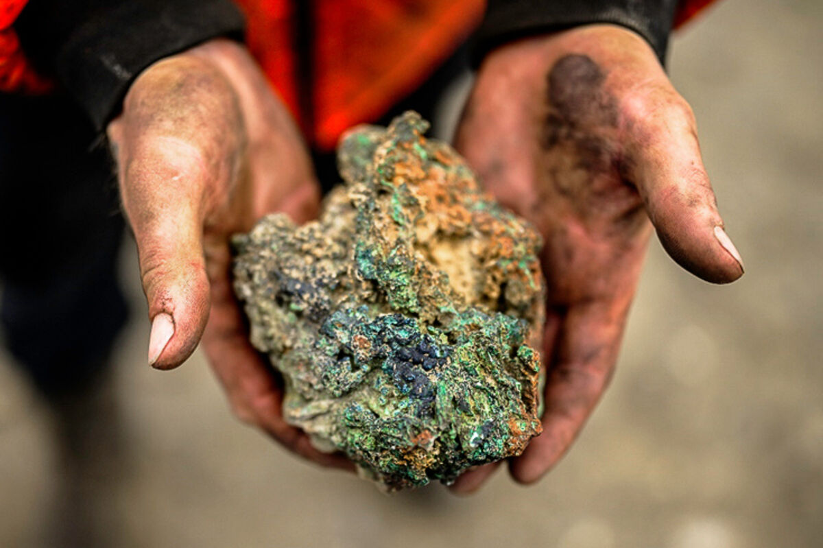


Ground truth: the palette held up against the places it has to live.
MADE IN AMERICA
HCM · BRAND KIT V208
07 · THE LOGOMARK — STILL TO BE DECIDED
The wordmark is ready today. The mark joins it as the brand develops.
Everything in this kit so far runs on the wordmark alone — letterhead, email, documents, filings. That is deliberate: the wordmark can go to work now, and a logomark can be added to every lockup without reprinting anything. Two families of candidates are in development below.
APPROVAL REQUESTED
FOR INTERIM USEThe wordmark stands on its own until the full brand direction is finalised
FOR INTERIM USEThe wordmark stands on its own until the full brand direction is finalised
CANDIDATE A · THE COPPER NUGGETFIRST LANDED ON
DIGITAL FURNITURE
TSXV : HCM
FAVICON 28 / 20 / 14
Native copper cut to seven faces with the green heart — drawn from the ore itself. Ownable, geological, quiet.
CANDIDATE B · OTHER DIRECTIONS EXPLOREDGEOLOGICAL → AMERICAN-FORWARD
THE PIT · BENCHES
THE CORE SLICE
UNDER THE COVER
THE COPPER STAR
 THE FLAG · REDRAWN
THE EAGLE · ABSTRACT
From the geological family already explored to sharper American-forward symbols — star, shield, eagle — drawn in the same copper, graphite and green heart.
Decision to follow with the full brand direction — neither candidate blocks anything in this kit.
HCM · BRAND KIT V209
08 · LITHIUM FIRST — THE STORY OPENS AT WILLCOX PLAYA
Homeland lists as a lithium story — the drilled, logged Willcox Playa project — and grows into a copper story. The brand doesn’t change to make that shift: same wordmark, same palette, same voice. Only the mark’s heart turns — graphite for lithium, verdigris for copper — and the photography moves from the playa to the pit.
LITHIUM · GRAPHITE HEART
→
COPPER · GREEN HEART

One system, two chapters: launch on lithium at Willcox, carry the identical identity into copper as the portfolio matures.
HCM · BRAND KIT V210